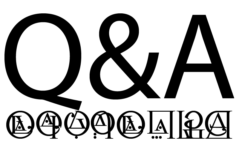
 So I have posted my font download page on some forums and have received some questions, helpful statements and even signs of frustration. Thought would be a good idea to re-post those here. I guess this Q&A session just better explains the whole idea behind the alphabet.
1
Q – And how is it inspired by architecture? Doesn’t look like any known building element to me.
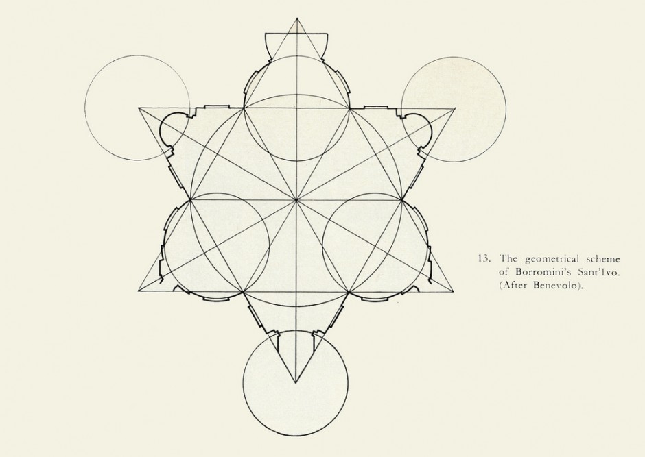
A – Why look at it so directly obviously? Can inspirations from architecture come only from a building or its element? It is about simple forms creating complex compositions and then those being translated into something writable and readable. Francesco Borromini drawn plans of his famous Baroque Architecture by composing simple geometrical shapes. Here’s a good example:


2
Q - Sorry but I can’t read it.
A – Can you read Chinese? In order to be able to read it one would have to learn it. Our Latin alphabet seems simple to us just because we are used to it since early days of our lives, but even then we had to go through a lot of effort to learn it at school.
Q - In fact I can read some chinese, as I have spent the last 9 months living here, but that’s not the point. The chinese language revolves (as it often does) around it’s alphabet and vice versa. You have no language to cater to.
All you have done is made an existing alphabet unreadable. You have not created an alphabet from what I can tell, but rather a font.
A – You are confusing an alphabet with a language. I have created an alphabet, but not a language; then applied a Times New Roman font to it. You can check the previous posts on a blog to see a written version of it.
This alphabet hasn’t got a language behind it, true, but it could be applied. And you are right, at the moment the symbols are only a translation of our latin alphabet.
Oxford Dictionary describes an alphabet as:
“a set of letters or symbols in a fixed order used to represent the basic set of speech sounds of a language, especially the set of letters from A to Z”
3
Q – uuuh… ok. so it looks like x=ks in this alphabet?
A – It is. This alphabet is more about an experiment of creating symbols/shapes that could be readable as letters, which was limited to 24 symbols rather than 26 as in Latin alphabet. In this case, posted previously on my blog, I created compositions from squares, circles and triangles, which then developed into a simplified writable form and then was respresented as a Times New Roman style font.
4 – And little more analytical comment from user Lilalindy
In order to learn how to read this, people are have to going to remember a new set of shapes – a bit like learning wingdings so that you can read a piece of writing set out in that instead of the usual alphabet we see in ASCII.
Writing is just a representation of sound on paper (or some other medium that is capable of presenting an equivalent).
If you want to be truly inventive, then look at the way that alphasyllabaries or abugidas work and thus, make it worthwhile for the learner to take on your writing system.
With abugidas, you can represent sounds in a way that is unambiguous (they are phonetic). They take words and break them up into syllables and then represent each syllable with a set of marks that tells the reader how to make the sound.
Devanagari is a sufficiently rich abugida and you can use it to write down sounds from pretty much any language – if the reader knows to read it in the way that Sanskrit is written – all of it is explicit – then you can use it to remember how foreign words sound (the Latin alphabet is very poor at this task unless you are familiar with the way it is interpreted for a give language). Using a similar alphasyllabary (Gurmukhi), I could write down …
ਯਾ ਸਮ ਬੀਓ ਪੀਆਨ ਸੀਐਲੋ ਸੈਡਮਿਤਸੂ – Ja sam bio pijan cijelu sedamicu. (Bosnian)
ਅਮ ਫਾਸਤ ਬੀਅਤ ਤੋਆਤਾ ਸਪਤਾਮਿਨਾ – Am fost beat toată săptămâna. (Romanian)
In the second one, ‘beat’ would end up being pronounced like ‘beet’ and in the first, ‘bio’ would end up being pronounced like the ‘bio’ in ‘biology’ rather than ‘bee-oh’ and, if you don’t know what the accents do, it is a non-starter.
I took the Gurmukhi alphasyllabary (which I already know, I write my shopping list in it every day, I am that familiar with it) and produced a variant that looks like the U-Chan writing system (which is also an Abugida) and as a result, people who can read Gurmukhi as fluently as I can (in addition to those who leave me on the starting blocks) can read it without any problem. I even have a tee-shirt with article one of the UDHR in Punjabi written on it in that font and people can read it without any help but to the unsuspecting, it looks like U-Chen.
I like the idea of alternative writing systems but the characters need to be sufficiently differentiated and also worthwhile getting to know. If they represent in some way the way that the sound is produced then they are easier to learn and more worthwhile – look at the characters for pa, pha, ba, and ma (all labial consonants – look at the way the alphabet is laid out and see how much better it is than ‘abcdefg’) are written in U-Chan.
Keep up the good work – it is good to see fresh ideas.
Leave a Reply